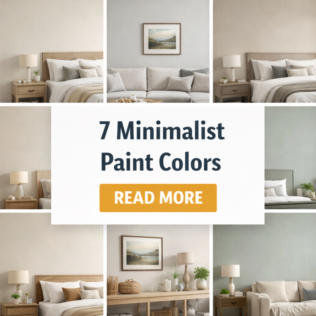
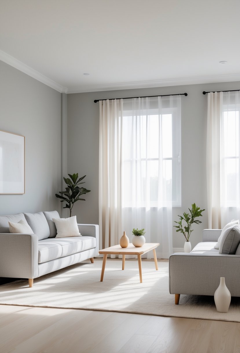
Minimalist paint colors focus on simplicity and calmness to create a clean and harmonious space. These colors help enhance natural light and promote a sense of tranquility by using neutral and subdued tones that avoid clutter and distraction.
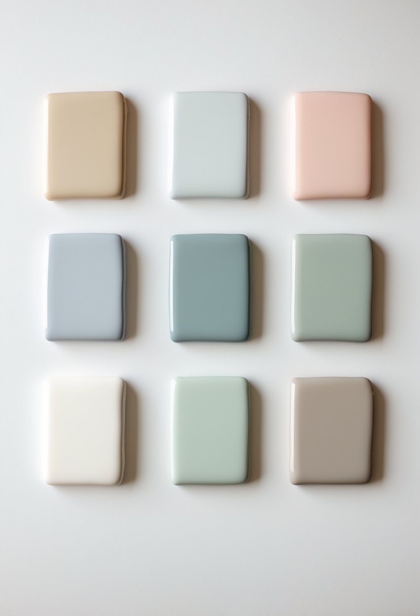
The key to choosing minimalist paint colors is selecting shades that support a peaceful, uncluttered environment while complementing furniture and textures. This approach helps maintain clarity and balance in any room, making it feel comfortable and inviting without overwhelming the senses.
1) Benjamin Moore White Dove
Benjamin Moore White Dove is a soft, warm off-white paint color. It has subtle creamy undertones that help create a calm and inviting space. This color works well in many rooms and fits with different design styles.
White Dove is often chosen for walls, trim, and moldings because it balances brightness without feeling too harsh. It reflects light nicely, which can make a room feel more open and airy.
Designers appreciate White Dove for its versatility. It pairs well with both cool and warm colors. Because it is not a pure white, it avoids looking too sterile or cold.
The color also adapts well to different lighting conditions. It can appear warmer in natural light and more neutral under artificial light.
Overall, White Dove is a reliable choice for those wanting a minimalist look that still feels soft and comfortable. Its subtle warmth adds depth while maintaining simplicity.
2) Sherwin-Williams SW 9611 Minimalist
Sherwin-Williams SW 9611 Minimalist is a neutral paint color known for its soft, warm beige tone. It has subtle earthy undertones that make it adaptable to many interior styles.
This paint offers a balance between muted beige and soft gray. It creates a calm and serene atmosphere, which works well in minimalist and contemporary designs.
The light reflectance value (LRV) of this color is moderate, allowing it to brighten spaces without feeling too stark or cold. It pairs easily with both warm and cool color palettes.
Minimalist SW 9611 is suitable for walls, trim, and ceilings, giving a clean and fresh look while maintaining warmth. Its versatility makes it a popular choice for creating simple yet elegant rooms.
Due to screen variations, the color may appear slightly different in person. It is recommended to view physical samples before finalizing.
3) Sherwin-Williams Agreeable Gray
Sherwin-Williams Agreeable Gray is a popular neutral paint color. It is a light greige, which means it mixes gray and beige tones.
This color works well in many spaces. It pairs easily with both light and dark colors. Its neutral nature makes it suitable for living rooms, kitchens, bedrooms, and even smaller rooms like laundry areas.
Agreeable Gray has a balanced look. It leans warm without being too beige, so it fits well with minimalist designs. It has moderate saturation and a soft appearance.
Lighting can affect how this color looks. In bright natural light, it may show more gray tones. In dimmer rooms, the beige undertones become more noticeable.
Because of its versatility, it is often chosen for whole-house painting projects. Agreeable Gray helps create a calm, simple backdrop that supports various styles and furnishings.
4) Behr Minimalistic PPU25-12
Behr Minimalistic PPU25-12 is a soft, neutral paint color with a light, calming tone. It has an RGB value of 234, 235, 229 and a HEX code of #EAEBE5. This color reflects a good amount of light, with a Light Reflectance Value (LRV) of 82.51, making rooms feel bright and open.
This shade leans toward a subtle yellow undertone, giving it a warm but still very neutral appearance. It pairs well with other muted tones and is often chosen for minimalist or modern interior designs.
Behr Minimalistic works well on walls in living rooms, bedrooms, and kitchens. It can serve as a clean backdrop that allows furniture and décor to stand out without overwhelming the space. The shade’s simplicity adds to its versatility, fitting both contemporary and classic styles.
5) Sherwin-Williams Alabaster
Sherwin-Williams Alabaster is a soft, warm white paint color. It has subtle creamy undertones that add warmth without being too yellow or beige. This makes it a popular choice for creating calm, inviting spaces.
Alabaster works well in many rooms, from living areas to bedrooms. It reflects light nicely, helping rooms feel bright but not harsh. Designers often choose it for its versatility and neutral tone.
This color pairs easily with other shades. It matches well with both cool and warm colors, making it simple to coordinate with furniture and décor. It is also used on walls, trim, and ceilings for a clean, coherent look.
Alabaster’s warmth sets it apart from pure whites. It avoids feeling cold or sterile, which makes it suitable for minimalist styles that still want a cozy touch. It is considered timeless and widely recommended for modern and traditional homes.
6) Benjamin Moore Revere Pewter
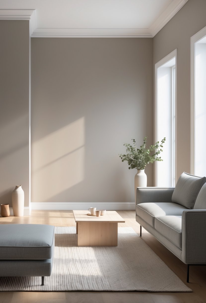
Benjamin Moore Revere Pewter is a popular mid-tone greige. It blends gray and beige in a balanced way, giving a warm but neutral look.
This color works well in many rooms. It has enough depth to avoid looking washed out or too dark.
Revere Pewter suits open floor plans because it pairs nicely with different finishes and styles. Its warm undertones make it feel inviting without being overpowering.
The paint has a light reflectance value around 55, meaning it reflects a moderate amount of natural light. This helps rooms feel bright but cozy.
Revere Pewter adapts to various lighting conditions, changing slightly depending on the time of day. It can lean more gray or beige depending on the light and surrounding colors.
It is a versatile choice for walls, trim, and even exteriors. Designers often recommend it for its ability to work with other colors easily.
Overall, it is a reliable, timeless neutral that fits minimalist design goals well.
7) Sherwin-Williams Naval
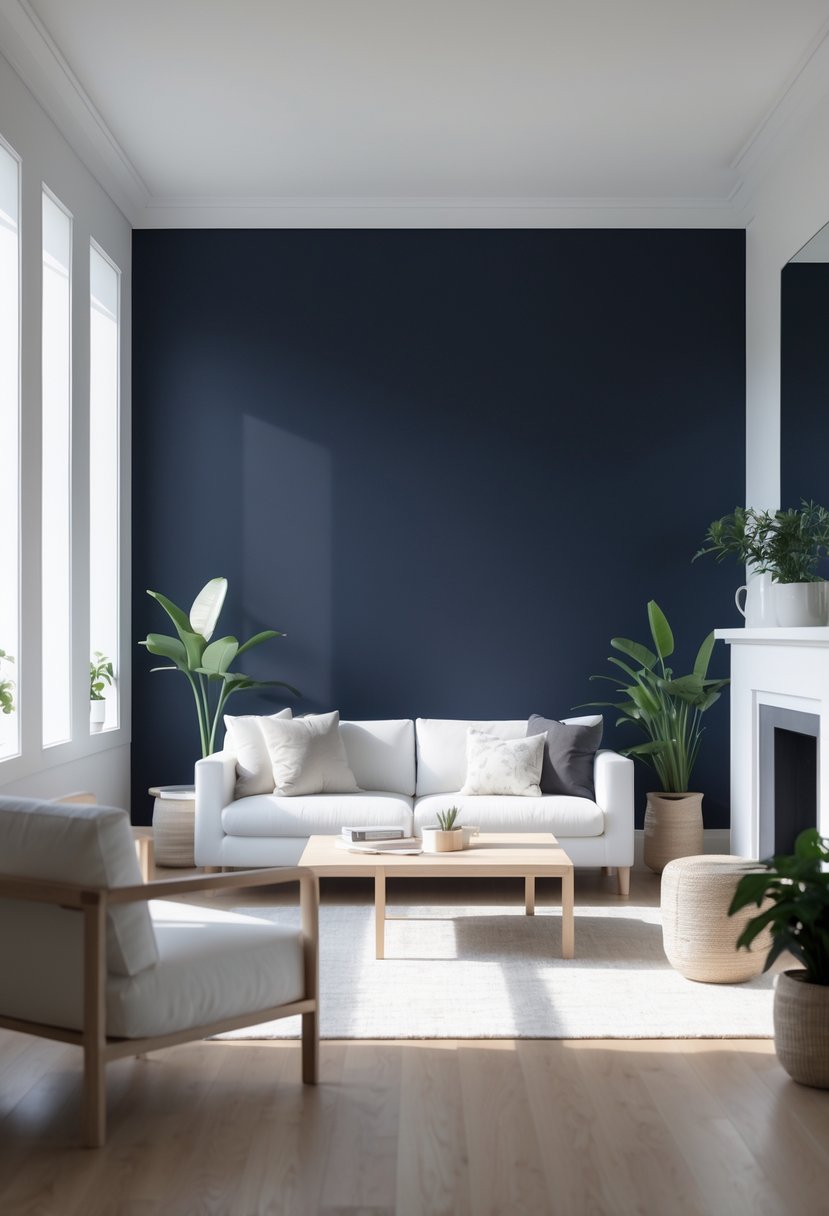
Sherwin-Williams Naval is a deep blue paint color that adds a calm and focused feeling to any room. It is often chosen to create a serene atmosphere, which can help with concentration and relaxation.
Though it is a strong blue, Naval works well in minimalist spaces because it is clean and timeless. It pairs nicely with neutral colors and can be used on walls, doors, or shutters.
Naval is also a popular choice for exterior paint. It gives a bold look without being too bright or flashy. The color fits well with many architectural styles and enhances curb appeal.
People appreciate its versatility. It can be used in both modern and traditional designs, making it a reliable option for many homeowners looking for a subtle but rich blue tone.
Benefits of Minimalist Paint Colors
Minimalist paint colors help shape a home’s atmosphere in clear and practical ways. They bring a calm feeling, make rooms feel larger, and fit easily with many styles and decorations. These colors create a balanced foundation that supports everyday living and design choices.
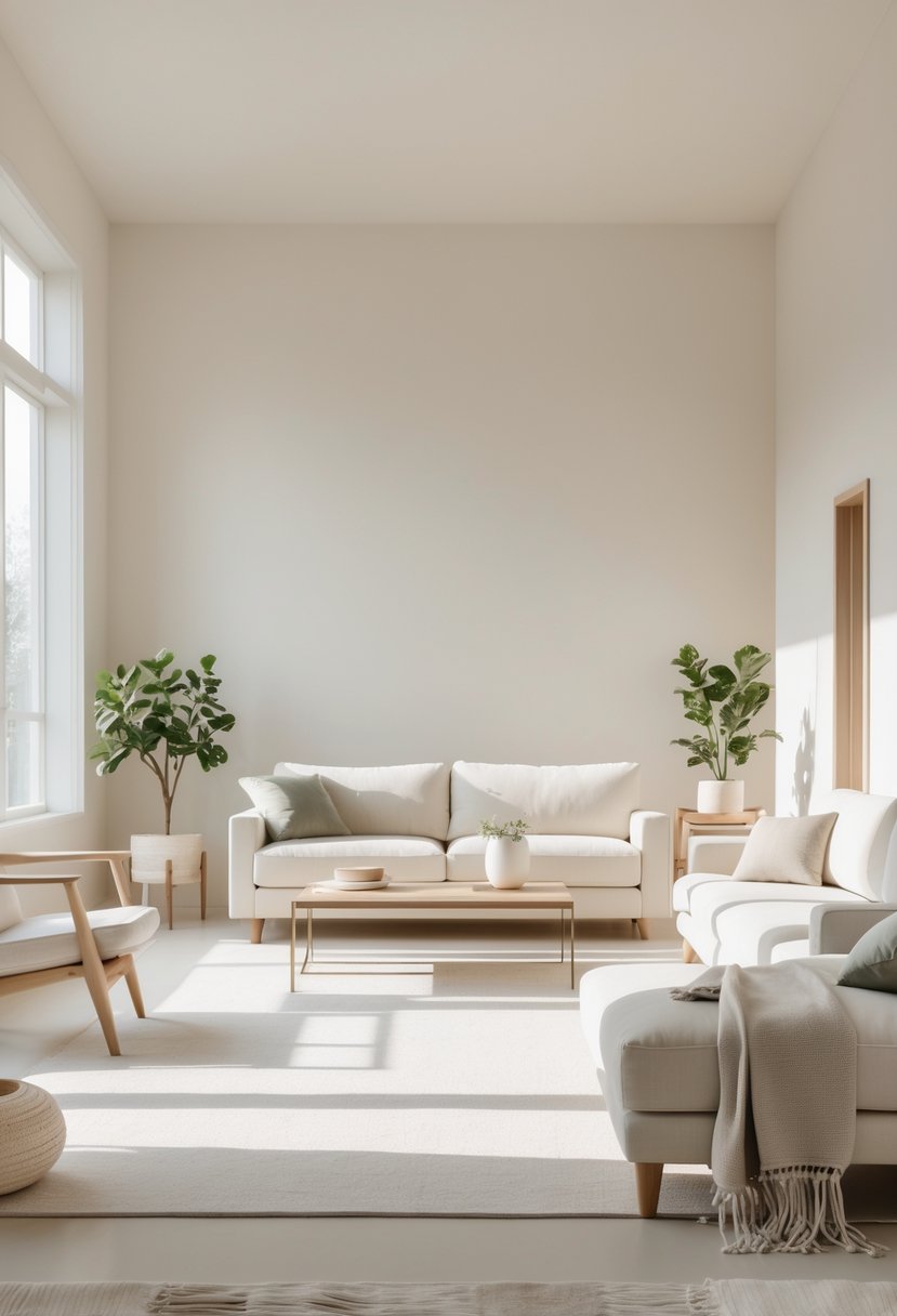
Creating Calm and Spacious Interiors
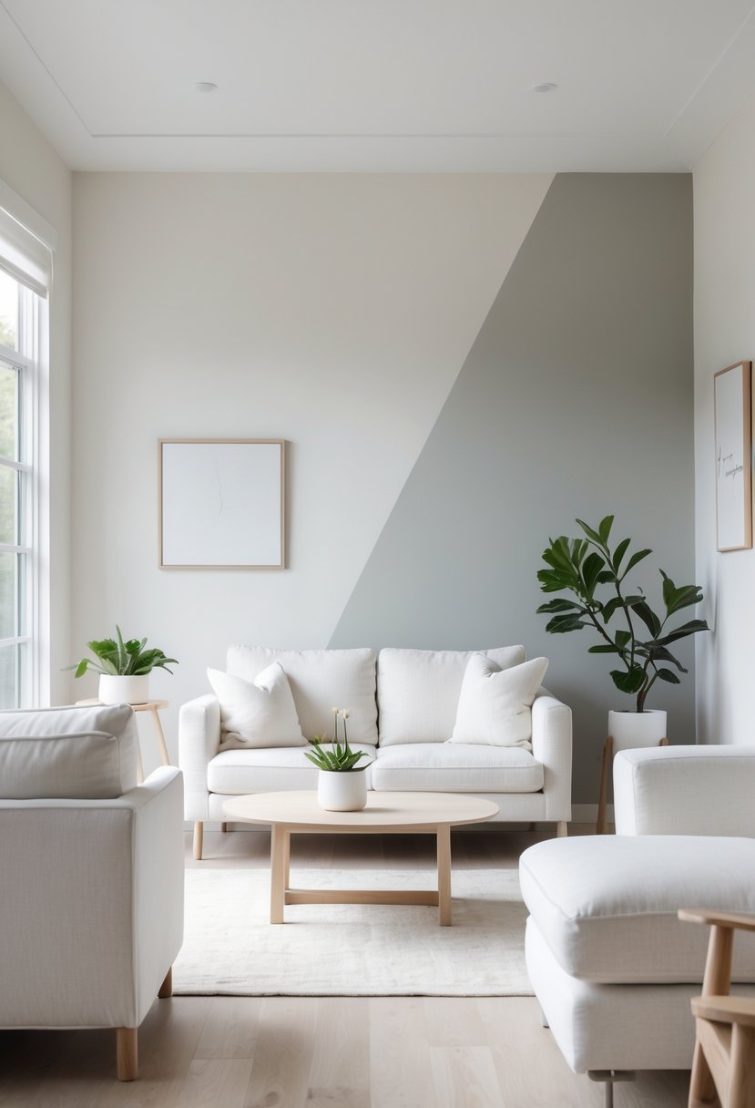
Minimalist colors like soft whites, light grays, and neutral beiges create a calm and uncluttered environment. These tones reduce visual noise, which helps lower stress levels and promotes relaxation. They give rooms a peaceful vibe that makes it easier for people to focus or unwind.
Using light, muted colors also tricks the eye into seeing more space. Minimalist paint reflects more light, which opens up rooms and avoids a cramped feeling. This effect works well in small or busy spaces, making them feel more breathable and inviting.
Enhancing Natural Light
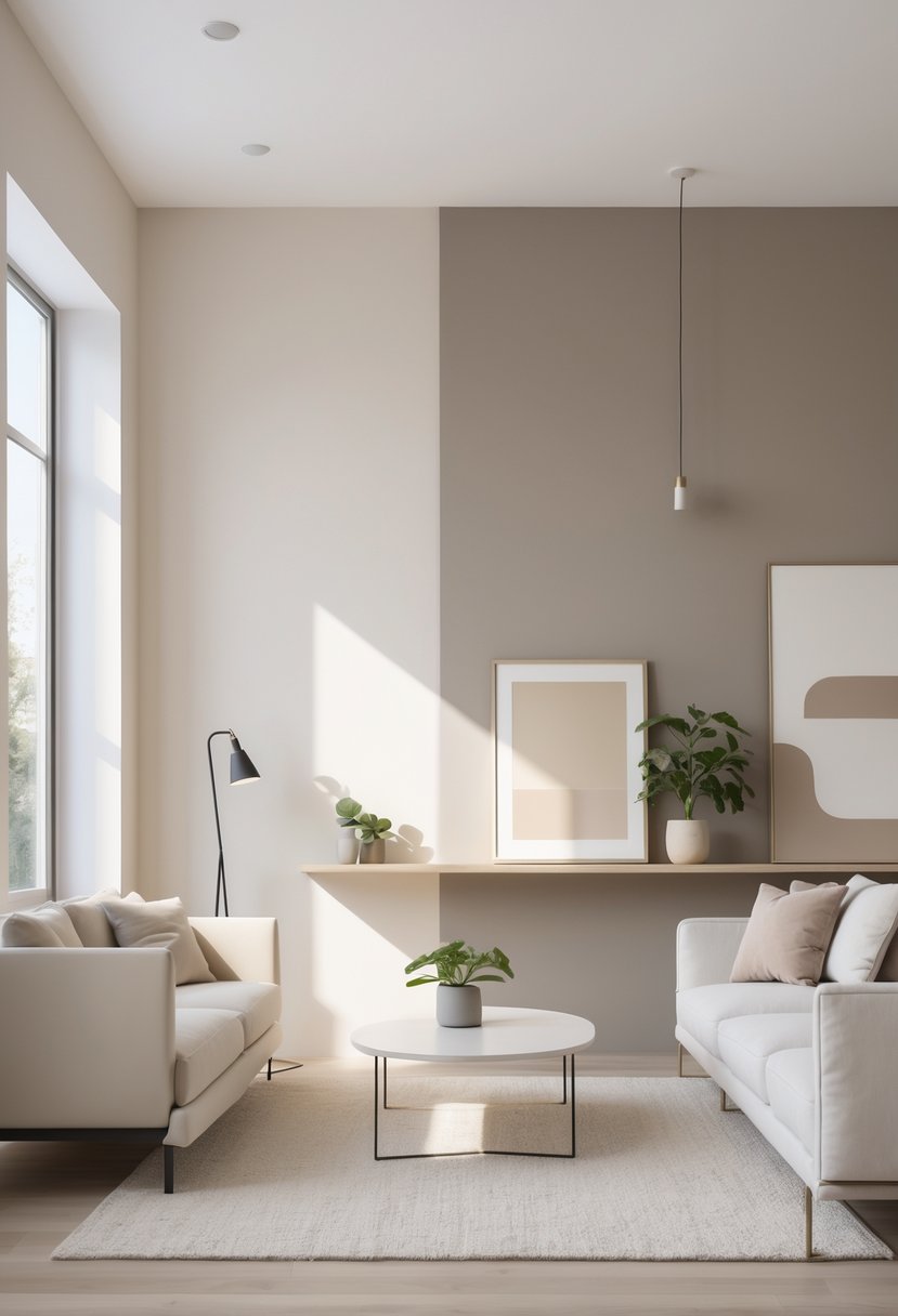
Minimalist colors are excellent at maximizing natural light in a room. They reflect sunlight without tinting it, keeping the space bright and lively throughout the day. Walls painted in soft whites or pale grays amplify daylight, which means less need for artificial lighting during daytime.
This brightness helps highlight architectural details naturally. The paint acts as a gentle backdrop that doesn’t compete with windows or fixtures. By enhancing natural light, minimalist colors improve mood and keep rooms looking fresh and clean.
Fostering Versatility in Decor
Minimalist colors offer a flexible base for decorating. Their simplicity allows homeowners to add different textures, patterns, and colors without clashing. Neutral walls can support bold or subtle furnishings, making it easy to change styles over time.
These paint colors also work well in every room—from living areas to bedrooms and kitchens. Because they don’t dominate, minimalist hues blend with wood tones, metal accents, and various fabrics. This versatility reduces the need to repaint frequently during redecorating.
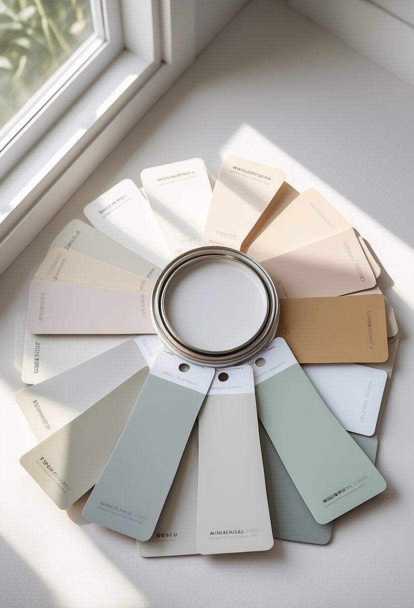
Tips for Selecting Minimalist Paint Colors
Choosing the right minimalist paint color depends on understanding how light and undertones affect a room. It also means making sure the color works well with furniture and accessories. These details help keep a space calm and balanced without feeling cold or empty.
Considering Undertones and Lighting
Undertones are the subtle colors hidden inside the main shade. For example, a gray might have blue or brown undertones. These affect how the color looks in different types of light. Natural sunlight will show colors closer to their true shade, while artificial lighting can change the color’s warmth or coolness.
Testing paint samples at various times of day helps reveal these changes. It’s best to paint small sections on different walls so you can see how the light impacts each spot. Choosing colors with softer undertones, like warm beige or soft gray with a hint of cream, can keep minimalist spaces feeling inviting rather than cold.
Complementing Furniture and Accessories
A paint color must work well with the room’s furniture and decor to create a cohesive look. Neutral colors like off-white, soft gray, or muted taupe provide a calm background. These shades help natural materials like wood or leather stand out without clashing.
It’s important to consider the color and style of textiles, artwork, and lighting fixtures. For example, if a room has dark wood furniture, light neutral walls can add balance. Using paint colors that match or gently contrast with key pieces adds interest without overwhelming the minimalist design.
Frequently Asked Questions
Choosing the right minimalist paint colors involves balancing neutral tones with the room’s natural light and size. Dark colors can work if used carefully. Accent colors should be subtle to keep the minimalist feel. Understanding how light interacts with paint helps maintain a calm and spacious look.
What are the most popular neutral paint colors for a minimalist aesthetic?
Popular neutral colors include Benjamin Moore White Dove and Sherwin-Williams Alabaster. Soft grays like Sherwin-Williams Agreeable Gray also fit well. These colors create a clean, calm backdrop that suits minimalist design.
How do I choose the right white paint for a minimalist room?
Selecting white paint depends on the room’s natural light and undertones. Sherwin-Williams SW 9611 Minimalist is a light shade with cool undertones, ideal for modern spaces. Warmer whites like Sherwin-Williams Alabaster work well in cozier rooms.
Can dark paint colors work in a minimalist interior design scheme?
Yes, dark colors like navy or forest green can add sophistication without cluttering the space. They should be used sparingly on accent walls or trim to maintain simplicity and keep the room feeling open.
What are the best minimalist paint colors for a small space?
Light neutrals such as Behr Minimalistic PPU25-12 and soft grays help make small rooms feel larger. These colors reflect light and reduce visual clutter, enhancing openness.
How does lighting affect the appearance of minimalist paint colors?
Natural and artificial lighting can change how paint colors look. Cool undertones may appear bluish in bright daylight, while warm lights enhance beige and cream tones. Testing paint samples in different lighting is important.
What are some tips for incorporating color accents with a minimalist paint palette?
Use accent colors sparingly to avoid overwhelming the space. Stick to two or three hues maximum, and place them on small features like trims or accessories. This adds depth while keeping the clean look intact.